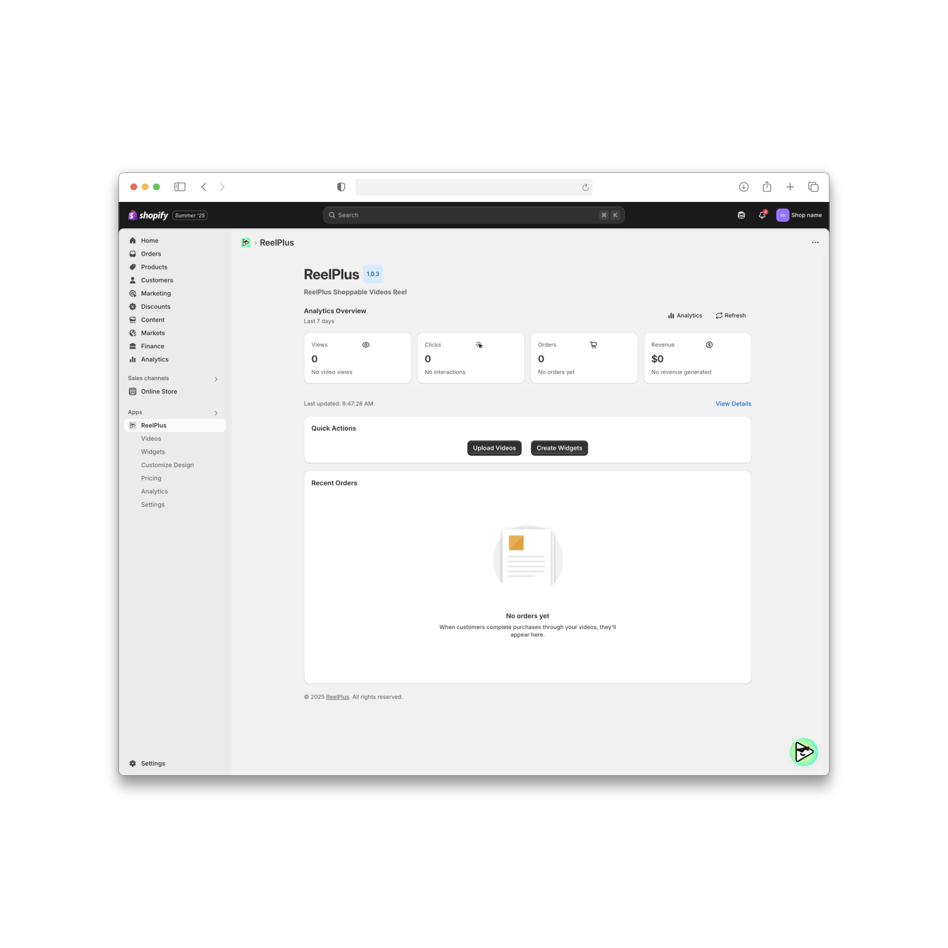
Redesigning ReelPlus’s video upload experience for Shopify merchants to reduce friction, eliminate confusion, and increase widget activation improving conversion from upload-to-activation for ReelPlus
This project focuses on improving the video upload experience for Shopify merchants. Many merchants were confused about the upload steps, worried about the performance impact on their store, and struggled to activate their video widgets. I redesigned the end-to-end flow with a performance-first approach, making the process clearer, faster, and more predictable. The new experience increased widget activation rates and reduced user frustration across the entire upload journey.

My Role |
As the Lead Product Designer, I owned the entire process from discovery to delivery. I audited the current flow, analyzed product data, and interviewed merchants who experienced upload issues. I identified core pain points through journey mapping and worked closely with engineering to understand performance limits and compression logic. | I designed the new upload, processing, and tagging experience using Shopify Polaris and supported the rollout through A/B testing to ensure adoption. |
Merchants struggled to upload videos because the flow lacked clarity, predictability, and performance transparency. They couldn’t see what was happening during upload, didn’t know how long it would take, and felt unsure whether large videos would slow down their store. This confusion also made widget activation harder, causing drop-offs and repeated attempts.
“Many merchants felt stuck during video upload because they couldn’t see progress.”
71% of test users abandoned upload when progress was unclear.
An unclear upload experience directly decreases activation and adoption. When merchants cannot complete the upload confidently, they cannot activate video widgets reducing engagement, limiting video usage across the store, and ultimately lowering the product’s value. Performance concerns amplify this issue: if merchants do not trust that videos are optimized and safe for site speed, they avoid using the feature altogether. Improving clarity and performance reassurance was essential to increasing activation, retention, and overall customer satisfaction.

What we wanted to improve in the upload and activation experience.
The goal of this project was to make the video upload flow simple, clear, and trustworthy for merchants.
Many users felt unsure about what was happening during upload, so we needed to design a process that showed every step in a predictable way. Another key goal was to reduce performance concerns by reassuring merchants that their videos were optimized and safe for their store. We also wanted to make tagging and activation easier, so users could finish the setup without confusion. Overall, the redesign aimed to help more merchants complete their uploads and successfully activate their video widget.
Design process
Design process
We began by understanding why merchants were struggling with video uploads and activation.
Through merchant interviews, session recordings, and product data analysis, we explored where uncertainty, hesitation, and drop-offs occurred across the upload flow.
At the same time, we worked closely with engineering to understand technical constraints around upload processing, compression, and performance optimization.
Design process
Data from 30+ interviews and session logs identified three primary pain points that directly informed design decisions.
01
02
03
Design process
For this project I followed an end-to-end product design process. I started by understanding merchant needs and current pain points, then moved into mapping the journey, exploring performance-first concepts, and testing the new upload flow with real users before rollout.
Understanding the problem, merchants’ needs, and performance constraints.
Experience audit, merchant interviews, analytics review.
Exploration, UX flows, performance-first UI decisions.
Prototype validation, A/B testing, iteration.
Rollout with engineering, monitoring impact and conversions.
Design process
Meet the Merchants We designed for a diverse set of Shopify users that shaped the upload and activation experience.
Design process
After mapping the full merchant journey, we conducted a bottleneck analysis to identify the exact moments where uncertainty, hesitation, and drop-offs occurred during the upload and activation flow.
01
Upload Started — No Clear Progress Feedback
Merchants couldn’t tell whether the upload had started or how long it would take. The interface didn’t show progress or expected timing, making users feel unsure from the very first step.
Effect: Early drop-offs and repeated upload attempts.
02
Processing Stage — Long Wait Without Context
After uploading, merchants saw a “processing” state but didn’t understand what it meant. The system provided no explanation or estimated duration, which made the step feel stuck or unpredictable.
Effect: Users refreshed the page, restarted the flow, or assumed the upload had failed.
03
Compression — No Visibility Into Optimization
During compression, merchants didn’t know why the system was compressing their video or how it affected store performance. The lack of transparency increased anxiety rather than trust.
Effect: Performance concerns increased, causing hesitation before activation.
04
Tagging — Confusing Rules and Unclear Results
Merchants struggled to understand how tags controlled widget placement. They were unsure where their video would appear on the storefront or whether they were tagging correctly.
Effect: Incorrect tagging, broken placements, and incomplete activations.
05
Activation — Uncertainty About Completion
At the end of the flow, merchants didn’t receive clear confirmation that their widget was activated successfully. They often didn’t know what the next step was.
Effect: Low confidence and increased support tickets.
Mapping the full journey made it clear that merchants were not failing because the feature was complex they were failing because the system didn’t communicate enough. This directly shaped our redesign priorities: visibility, predictability, and performance reassurance.
Design process
Based on research insights and journey analysis, we identified key opportunity areas where design intervention could have the highest impact.
These opportunities focused on improving system visibility, reducing performance anxiety, and preventing activation errors before they occurred.


Our redesign followed a performance-first strategy. The goal was to help merchants feel safe, confident, and in control while uploading their videos. We focused on making the experience clear, fast, and easy to understand.
Merchants should always know what is happening. We created a simple, step-by-step flow so they can see the upload, processing, and tagging stages without feeling confused.
The old flow felt heavy and confusing. We redesigned it so merchants complete one clear action at a time. This helps them move forward faster and with less stress.
Many merchants worried that videos would slow down their store. To fix this, we added real-time messages that show compression progress and confirm that the video will not harm performance.
Tagging was one of the main problems. We added auto-suggested tags and clear instructions so merchants can activate the widget quickly and avoid mistakes.
In the end, every design decision had one purpose:
Make the upload experience simple, predictable, and stress-free, so merchants feel confident from the first step to the final activation.
To ensure a native, seamless experience within the Shopify ecosystem, our design team adopted the Polaris Design System as the foundation for all UI decisions. Polaris provided a shared language between design and development, allowing us to move faster, stay aligned, and maintain a high level of consistency across the app.
How Polaris Helped:
→We used Polaris components (buttons, banners, modals, typography, etc.) to align the interface with Shopify’s visual and interaction standards.
→By leveraging Polaris spacing, color tokens, and responsive breakpoints, we ensured that the app looked and felt familiar to merchants.
→For custom elements like the compression slider and performance dashboard, we extended Polaris styles to maintain visual harmony while addressing unique product needs.
→Working within Polaris allowed us to reduce design-developer friction, speed up implementation, and deliver a UI that merchants could trust because it felt like a natural extension of the Shopify admin.
This section shows how merchants’ workflow, confidence, and environment transform after using the redesigned upload experience. It highlights what they can now do easily, what frustrations disappear, and how their overall interaction becomes smoother and more predictable.
Results
Design process
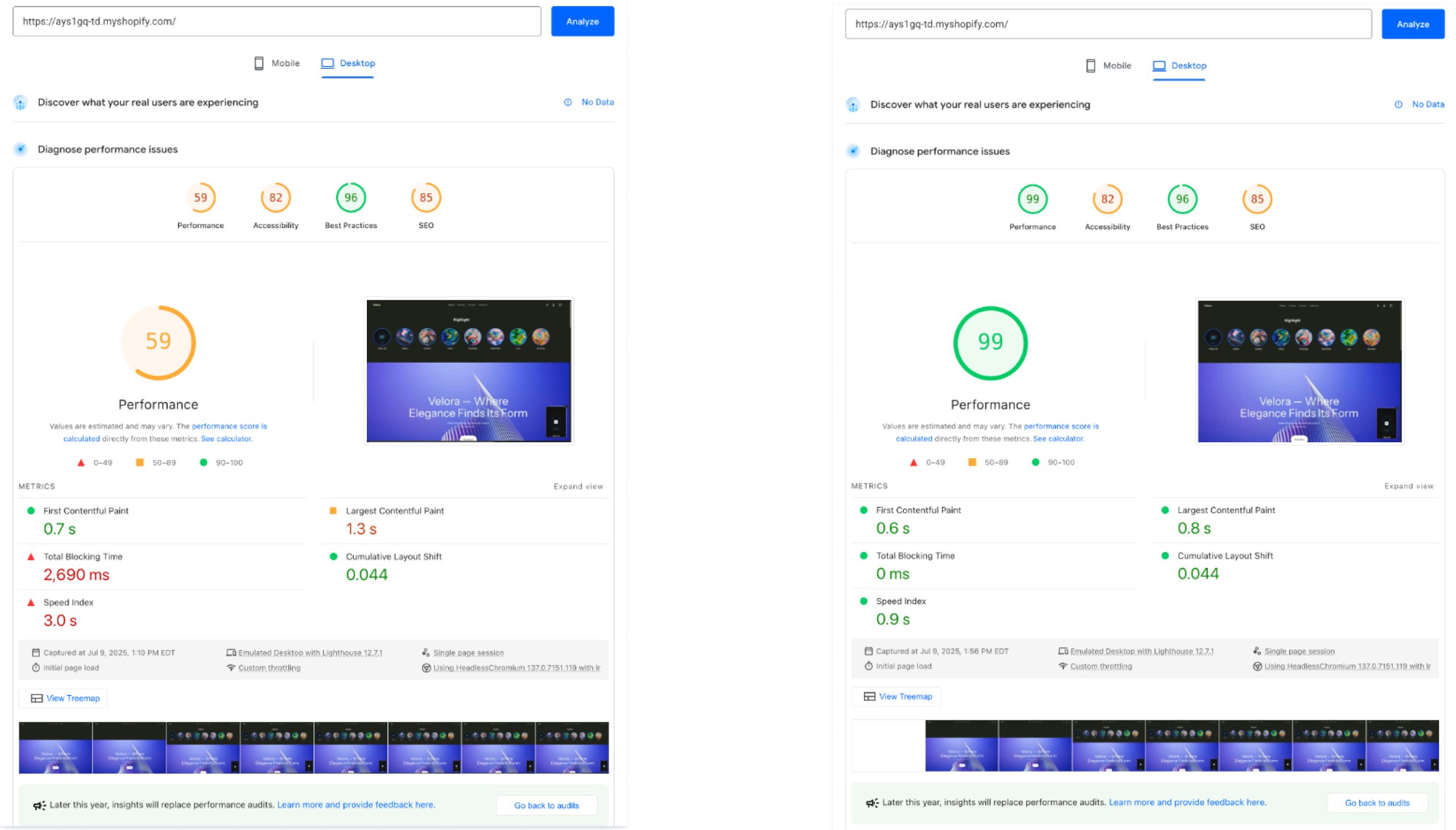
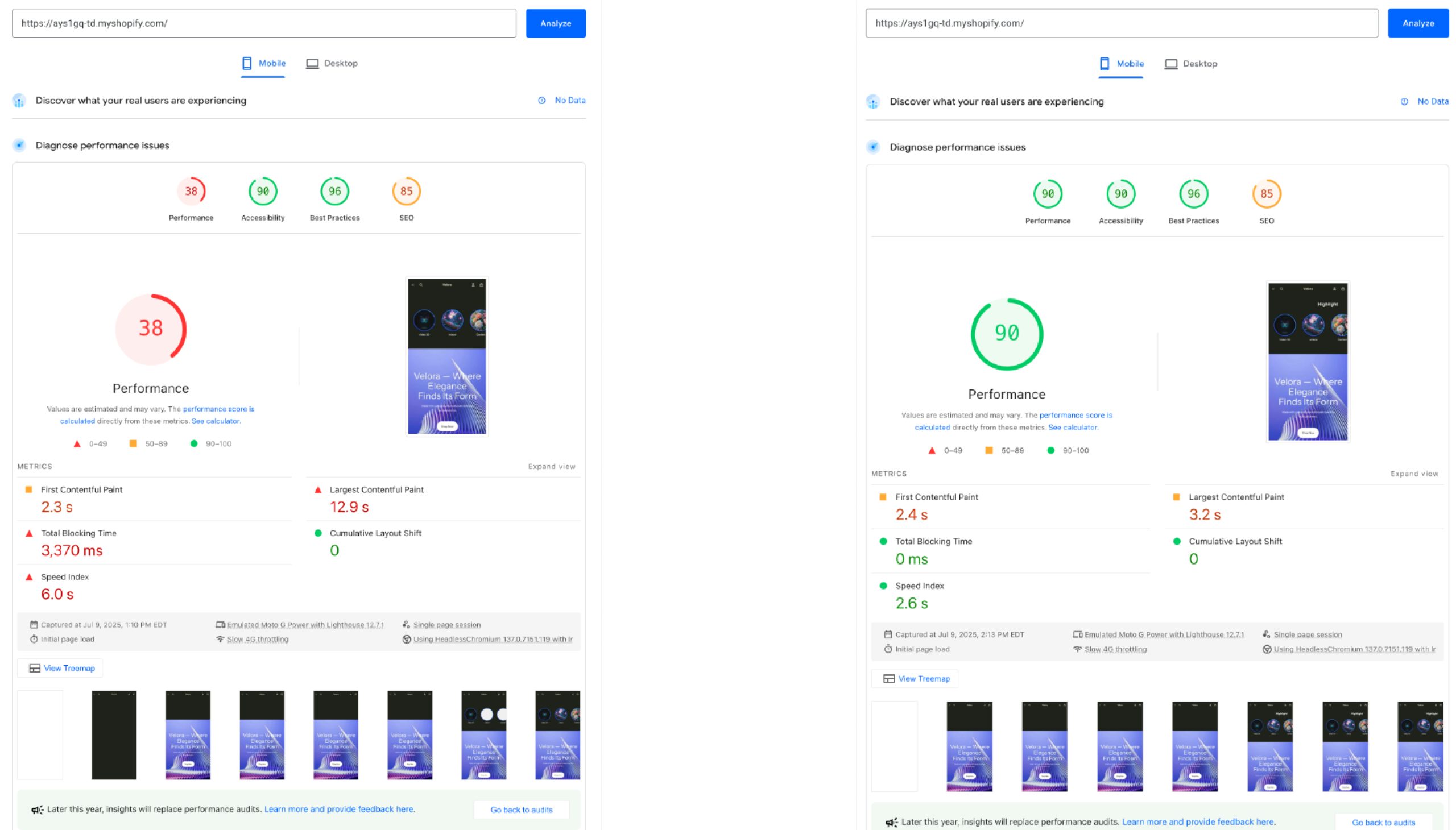
The redesign delivered substantial improvements across clarity, performance confidence, and completion rates. By making each stage transparent and predictable, merchants were able to complete the flow without confusion or hesitation.
Results were measured through A/B testing, session analysis, and post-release support data.
Clearer system states, real-time progress, and predictable transitions reduced user drop-offs.
Before: Many merchants abandoned the flow during upload or processing.
After: More merchants completed the flow and activated their video widgets.
Post-release user feedback highlighted:
A clearer understanding of each upload stage
Higher trust in system behavior
A predictable, low-stress workflow
Most retries were previously caused by uncertainty during upload and processing.
After redesign: Merchants no longer restarted the flow due to unclear or missing feedback.
Transparent compression messaging helped merchants trust that videos were optimized for speed.
Impact: More merchants were willing to use videos across their storefront.


The majority of tickets previously came from unclear steps or incorrect tagging.
Impact: Lower operational load for the support team and fewer friction points for merchants.
Guided tagging, auto-suggestions, and inline explanations drastically reduced incorrect placements.
Impact: Fewer broken widgets and fewer incomplete activations.
01
Clear system feedback matters more than raw speed
Merchants felt more confident when each upload state was clearly communicated, even if processing took slightly longer.
02
Performance anxiety can block adoption before real issues occur
Lack of transparency during compression increased hesitation, while real-time reassurance helped merchants proceed with activation.
03
Users fail when systems are silent, not when features are complex
Most drop-offs happened when the interface did not explain what was happening during upload and processing.
04
Guided flows outperform flexible but unclear setups
Tagging errors dropped significantly once rules were explained through guided steps instead of free-form choices.
05
UI must reflect real backend states to build trust
Aligning UI states with actual upload, processing, and compression behavior reduced retries and failed activations.
06
Preventing errors is more effective than fixing them later
Designing for correct first-time activation reduced support tickets and removed the need for post-setup troubleshooting.