
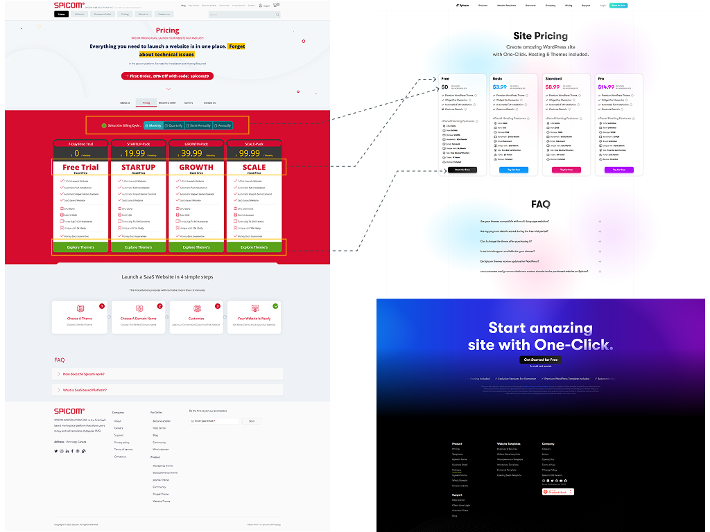
From Concept to Completion: Lo-fi to Hi-fi evolution of Spicom’s redesigned pricing page.
Spicom operates as a SaaS-based marketplace, offering users the ability to create websites through a subscription model. Initially, users could explore the platform through a free trial before deciding to upgrade to a paid plan. However, the data revealed several significant challenges that prevented optimal conversion rates. Many users engaged with the free trial but never moved to a paid plan. Upon further investigation, it became evident that the pricing structure was confusing, and users struggled to differentiate between the available subscription plans. Additionally, the value of premium features was not clearly communicated, leaving users hesitant to commit to an upgrade.
As a Product Designer, I took on the challenge of improving Spicom's subscription model. By conducting thorough data analysis, user research, and iterative design improvements, I was able to create a more intuitive pricing experience. This effort led to an increase in conversions, enhanced user retention, and ultimately, higher revenue for the company.
Subscription plans, only 12% of trial users upgraded—a sign that something was wrong. The previous pricing page was cluttered, making it difficult for users to understand the differences between plans. The color scheme and layout overwhelmed visitors, while the lack of clear feature breakdowns left them confused about what they were paying for.
“I like the free plan, but I don’t understand why I should upgrade. What exactly am I getting for my money?”
This lack of clarity impacted not just user experience but also business growth. With low trial-to-paid conversions and a high churn rate among existing subscribers, it became clear that the pricing page needed a complete redesign to be more transparent, intuitive, and conversion-friendly.
To understand why users were hesitant to upgrade and why the pricing page wasn’t converting, I led a comprehensive research phase that combined quantitative data (analytics, heatmaps, session recordings) with qualitative insights from user interviews and surveys.
I used tools like Google Analytics, heatmaps, and session recordings to track user interactions on the pricing page. The goal was to identify where users dropped off and what elements caused friction in their decision-making process.
Numbers tell part of the story, but we needed direct user feedback to understand the emotional and psychological factors influencing their decisions. I conducted 8 in-depth user interviews with a mix of free trial users, paying subscribers, and users who canceled their subscriptions. Additionally, a survey was sent to 500 trial users, asking about their decision-making process.

I like the free version, but I don’t know if the paid plans are worth it.

I don’t see a big enough reason to upgrade from the free plan.

Is there a refund policy if I don’t like the paid plan?

“I don’t know what’s included in each plan. I need a clearer breakdown.”
“I like the free version, but I don’t know if the paid plans are worth it.”
“I don’t see a big enough reason to upgrade from the free plan.”
“Is there a refund policy if I don’t like the paid plan?”
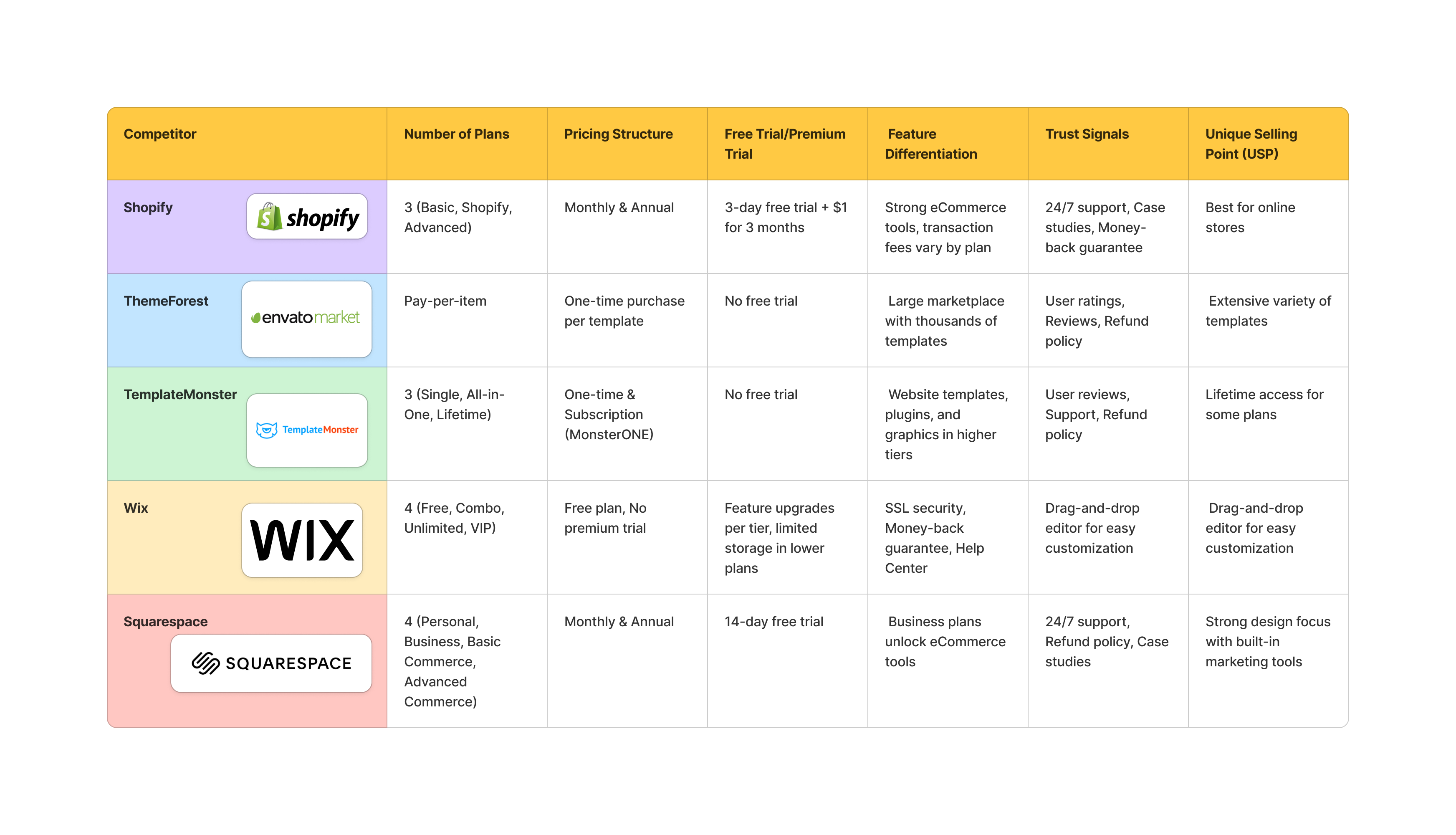
To ensure Spicom’s pricing model was competitive, I analyzed 5 major SaaS competitors 5 major SaaS competitors offering similar subscription models.
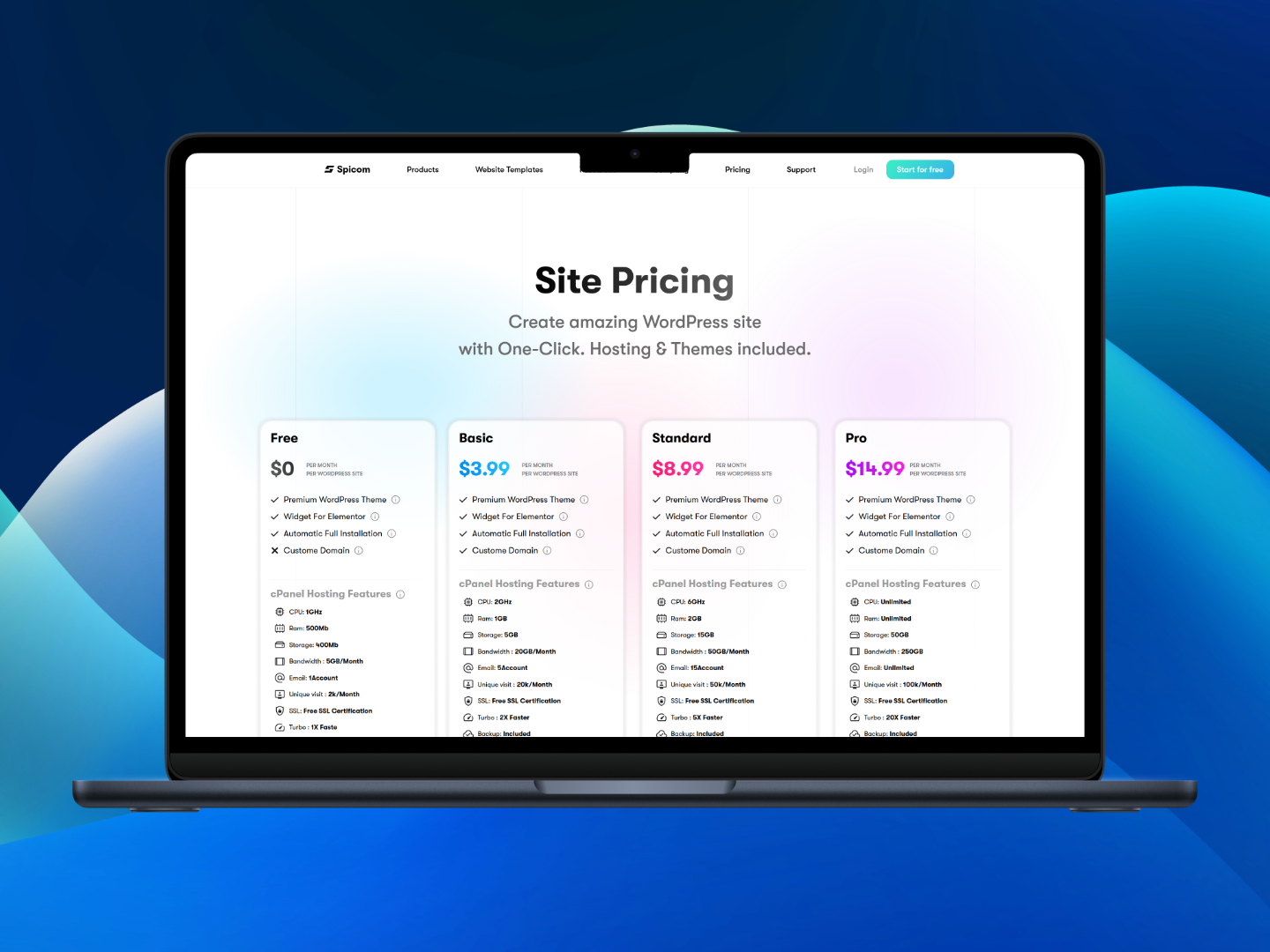
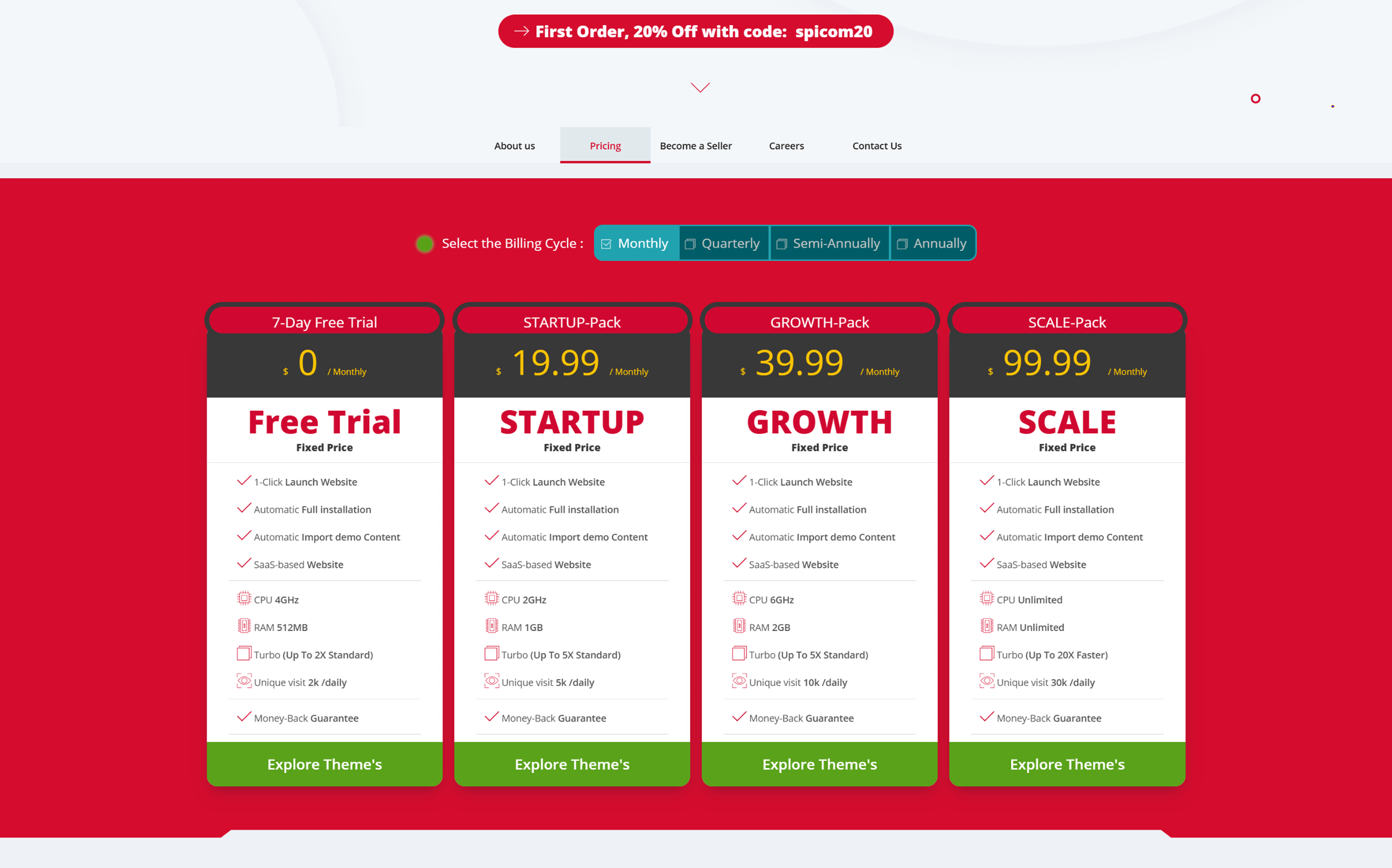
Based on the research insights, I led a complete redesign of Spicom’s pricing experience with a focus on clarity, trust, and conversion. The new design aimed to eliminate user confusion and hesitation by introducing: A simplified pricing layout with side-by-side plan comparison Clear, benefit-driven descriptions of each plan and feature A limited-time premium trial to let users experience value before committing Trust-building elements such as testimonials, a money-back guarantee, and transparent billing terms Optimized call-to-action buttons and visual hierarchy to guide decision-making The result was a pricing page that aligned with user expectations, reduced friction, and encouraged more confident upgrades — ultimately driving a significant increase in trial-to-paid conversions and user retention.
What Changed in the Pricing Model To create a more user-friendly and competitive pricing experience, several key changes were made to the structure and presentation of the plans:
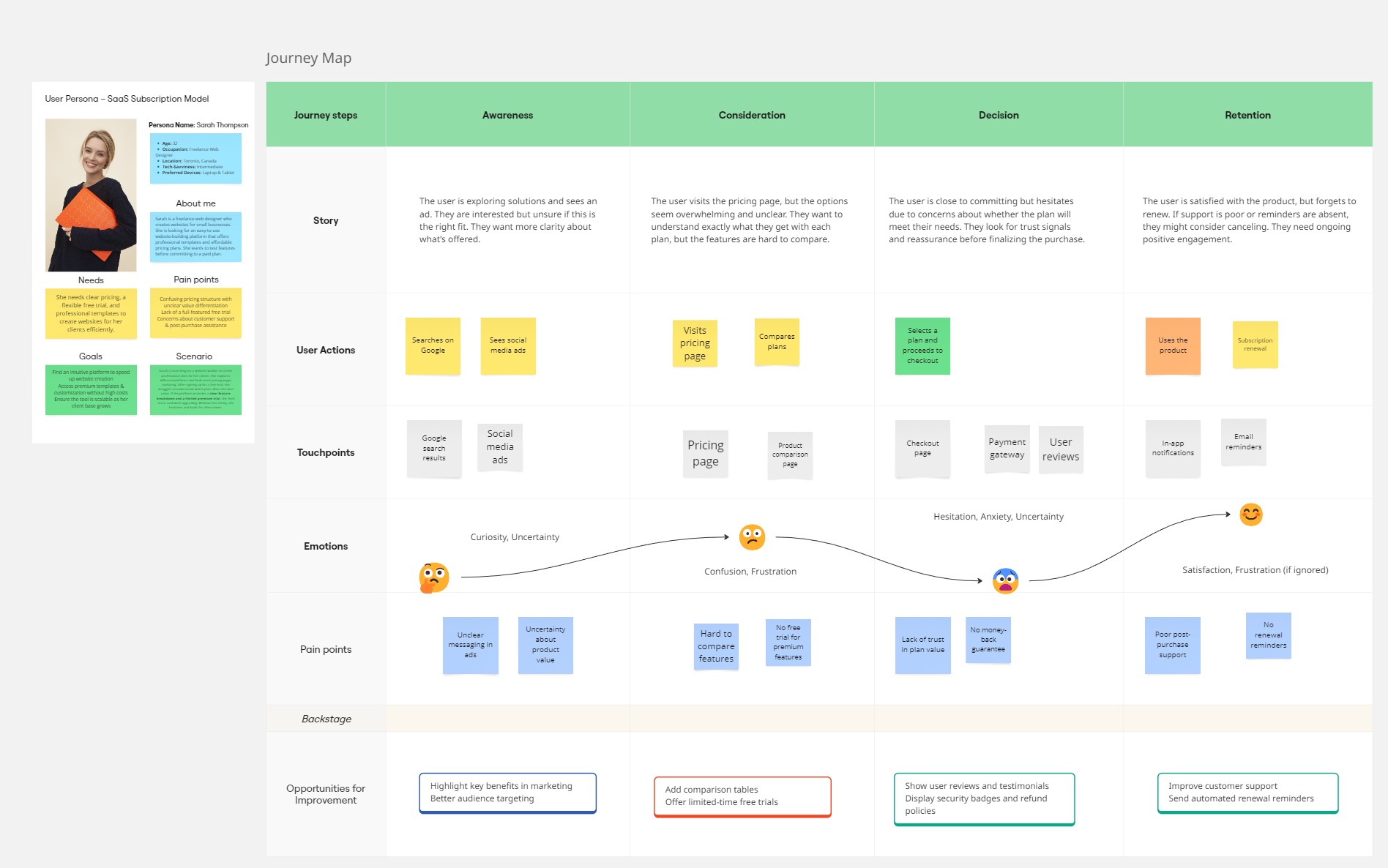
In designing a seamless and conversion-friendly user experience for Spicom, a SaaS-based website-building platform, User Journey Mapping played a crucial role in identifying key pain points and opportunities for improvement.
After identifying the main user pain points, I began with low-fidelity wireframes to quickly explore layout ideas for the pricing page. I then tested the wireframes with a few users to identify usability issues and refine the structure. The first round of feedback revealed confusion around the CTA placement and plan comparison. In response, I adjusted the hierarchy, introduced a clearer feature matrix, and improved the visibility of key actions. I then built a high-fidelity interactive prototype using Figma and conducted another round of testing — both with users and internal stakeholders. This iterative process helped ensure that the final design was not only visually clear but also aligned with user needs and business goals.
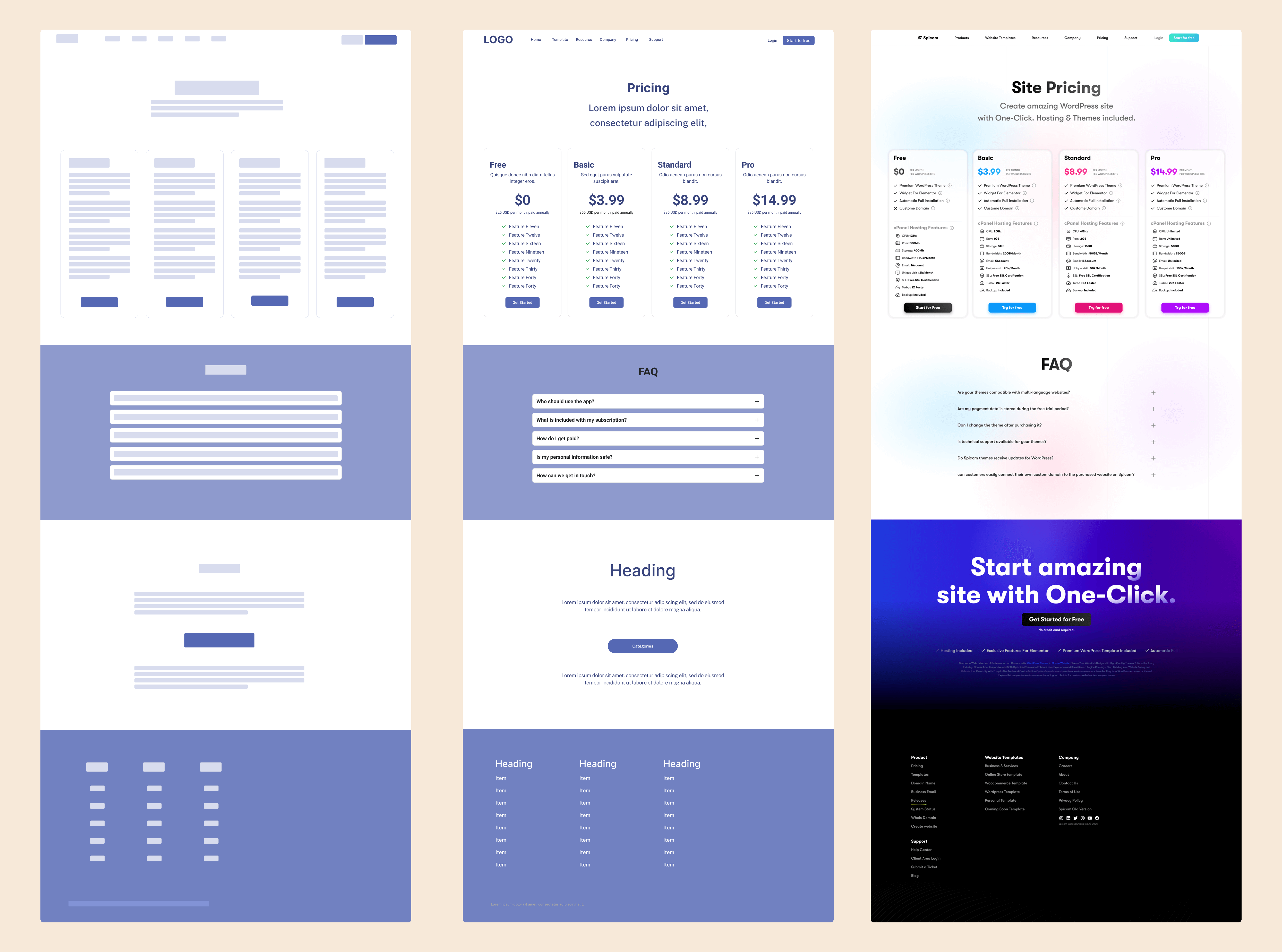
From Concept to Completion: Lo-fi to Hi-fi evolution of Spicom’s redesigned pricing page.
After implementing the redesigned pricing page, we closely monitored key performance indicators to measure the success of our efforts. The results showed significant improvements in user engagement, conversion rates, and overall revenue growth.
Trial-to-Paid Conversion Increase
Time Spent on Pricing Page
Churn Rate Reduction
Monthly Revenue Increase
One of the biggest challenges before the redesign was the low conversion rate from free trials to paid subscriptions, which stood at only 12%. After launching the new pricing page, the conversion rate jumped to 27%, marking a 125% increase in users upgrading to paid plans.
Before the redesign, 55% of users scrolled through the page without interacting, and many exited without clicking on a plan. With the new layout, engagement improved drastically:
Another major problem was high churn among paid users, as they often felt that premium plans didn't offer enough value. After optimizing feature sets and offering a 7-day premium trial, the churn rate decreased by 18%, meaning more users stayed subscribed for longer.
With higher conversion rates and lower churn, the company saw a direct impact on revenue:
“This redesign had an immediate impact — we’ve never seen this level of conversion before. It’s now our benchmark for future product changes.”
The redesigned pricing page not only improved user experience but also had a tangible business impact by increasing revenue, reducing churn, and optimizing the trial-to-paid funnel. This case study highlights the power of data-driven design, proving that a well-structured pricing model can significantly boost conversions and retention.